Themes
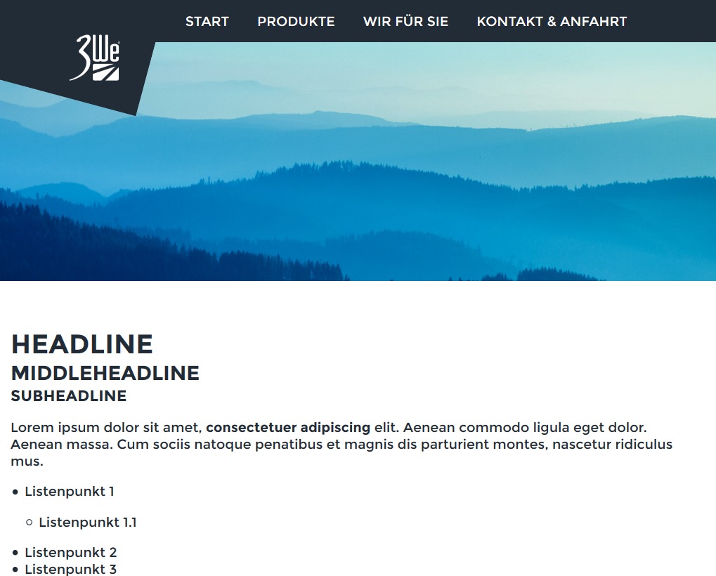
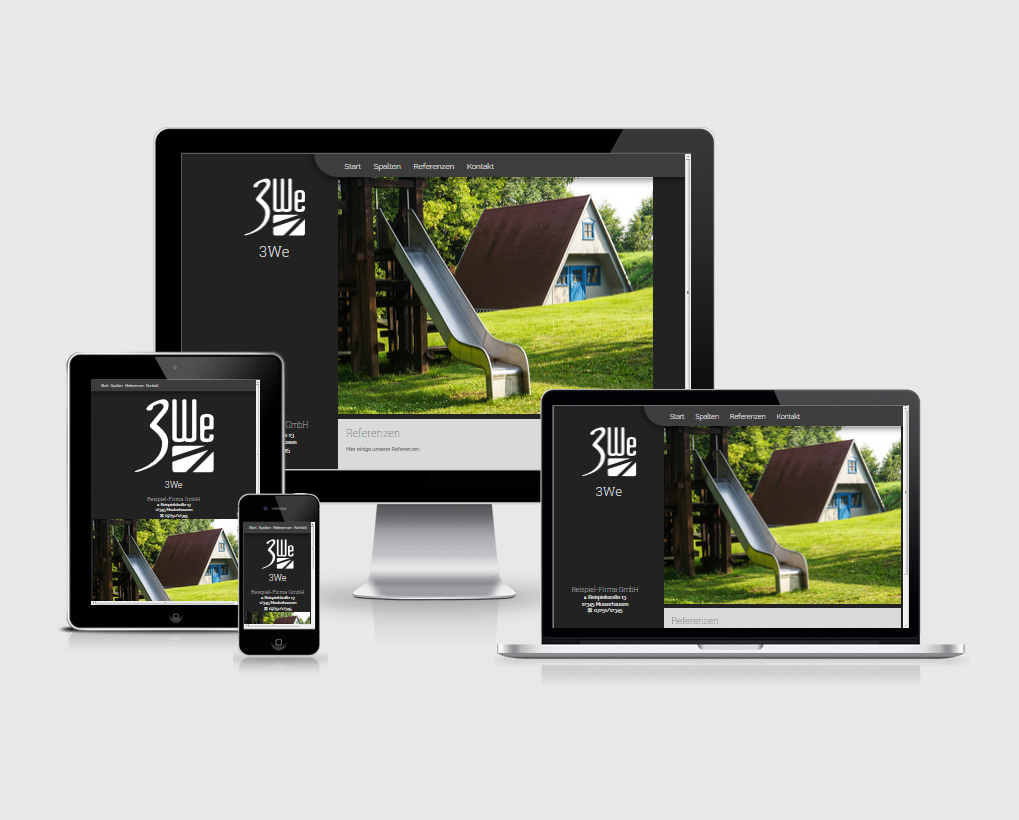
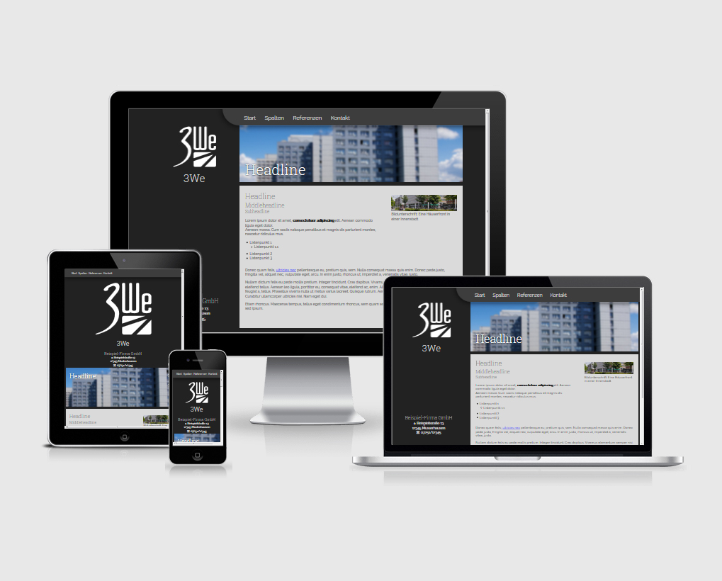
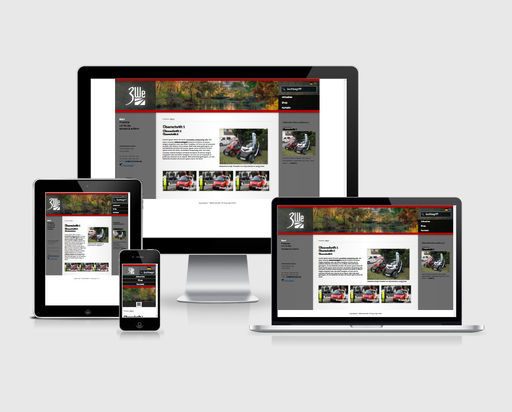
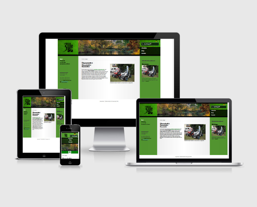
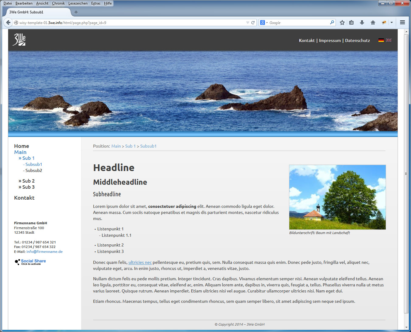
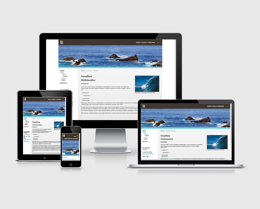
Here you can find the standard themes of the wisy CMS. Each of these themes can be used as a basis for your website and offers a cheaper alternative to a complete, custom design.
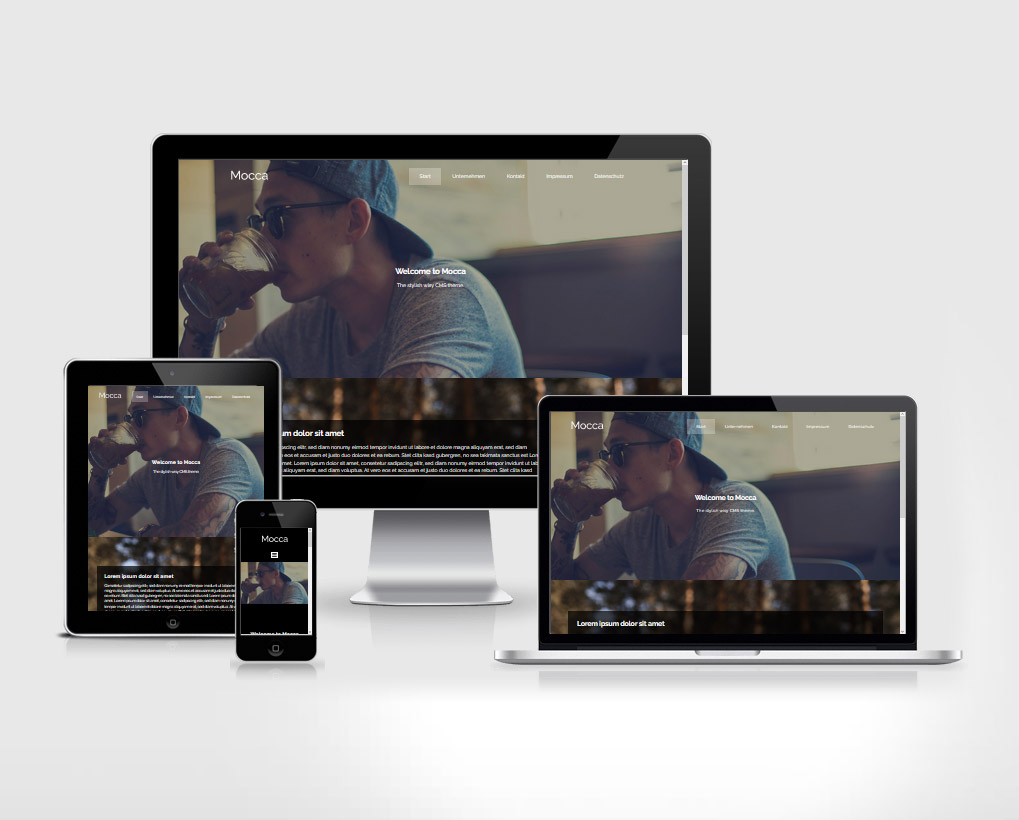
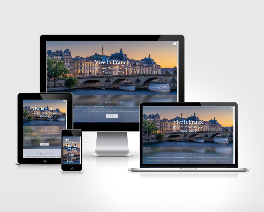
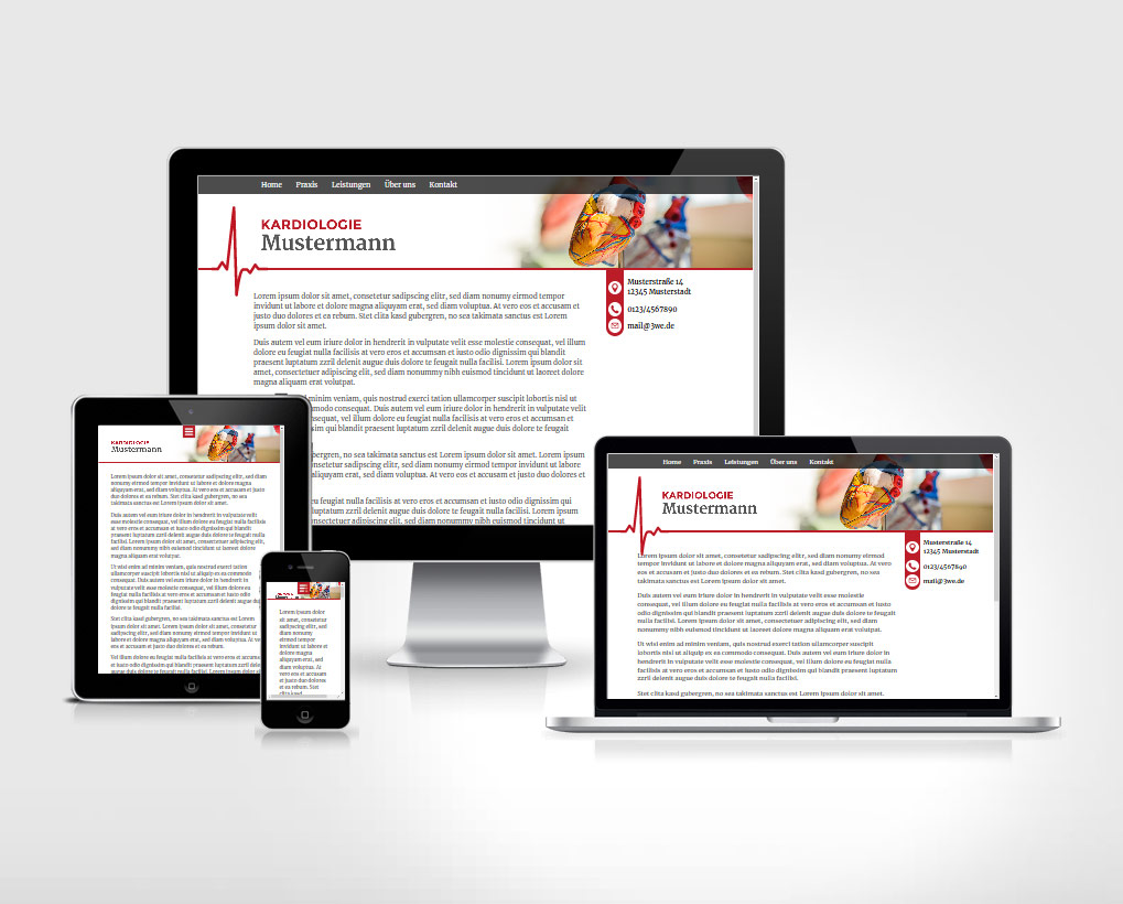
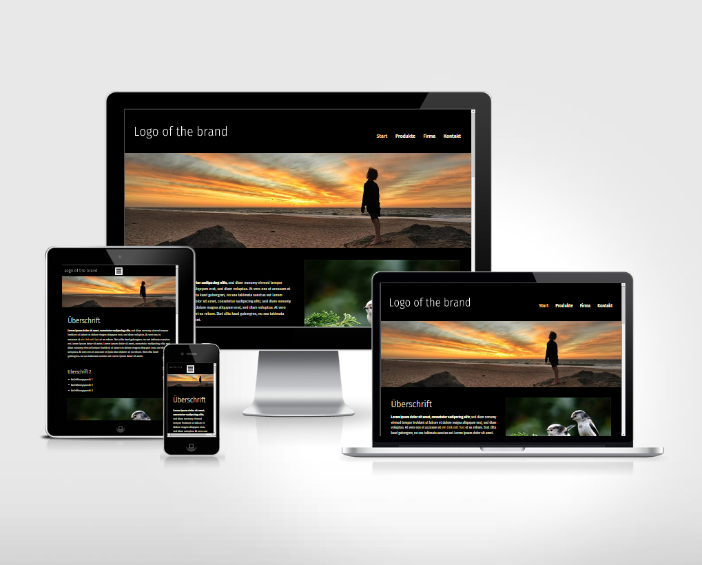
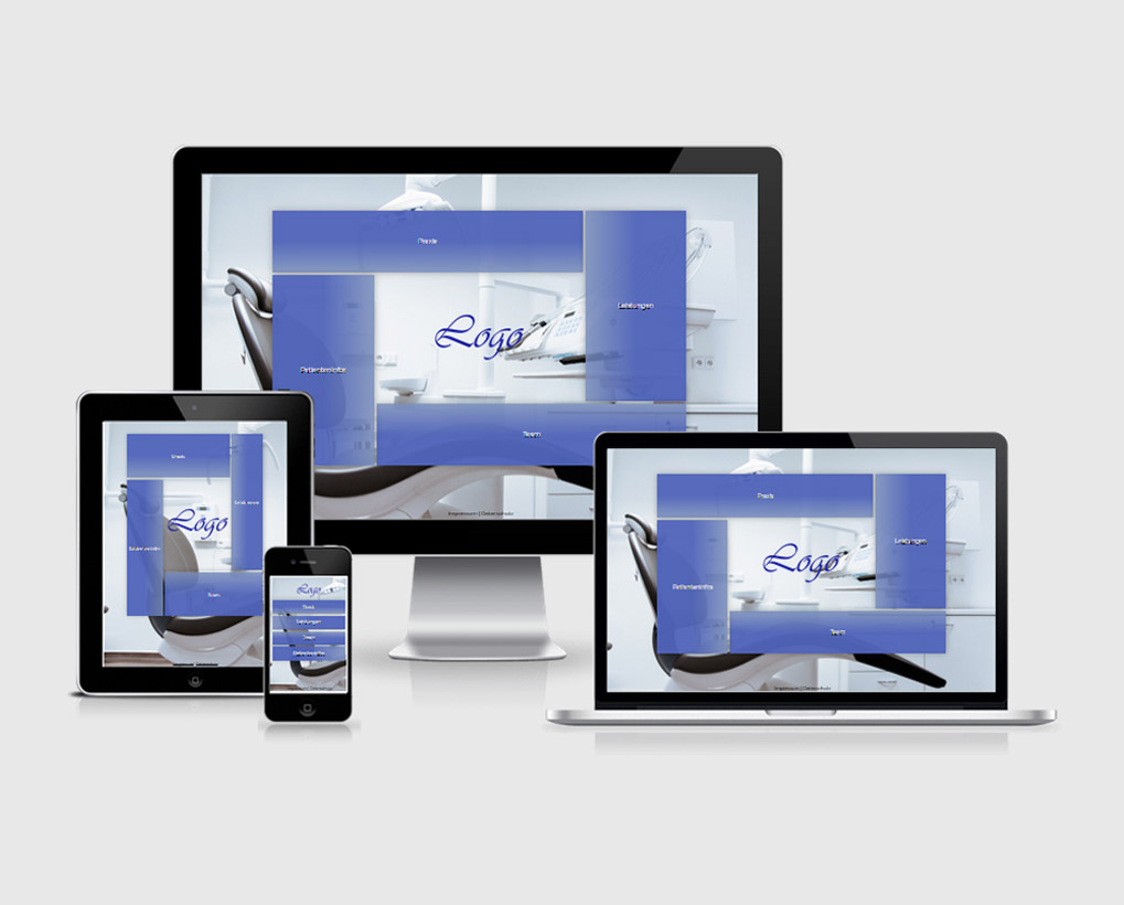
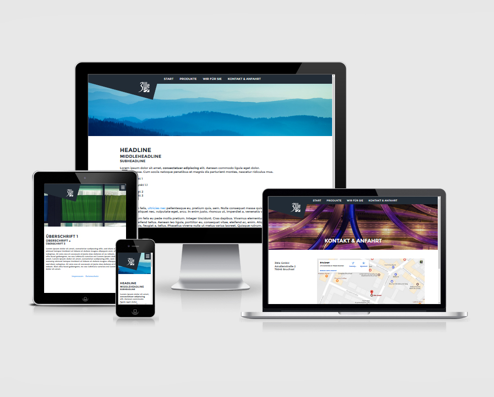
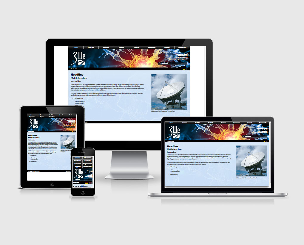
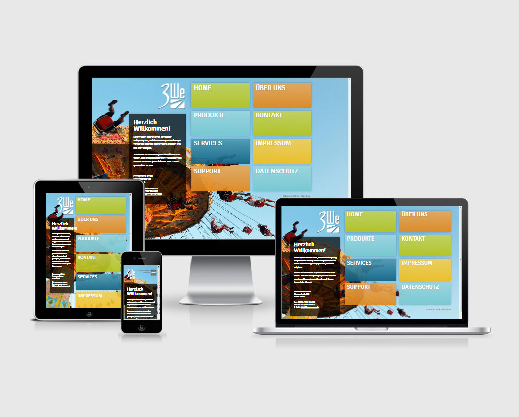
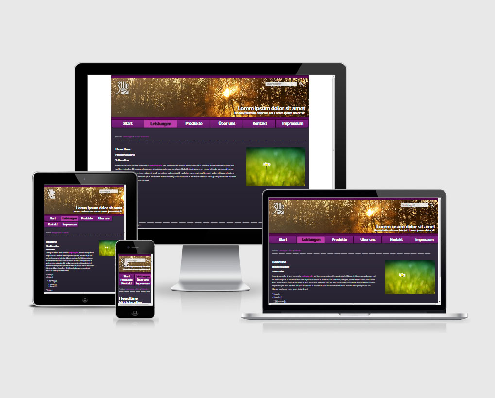
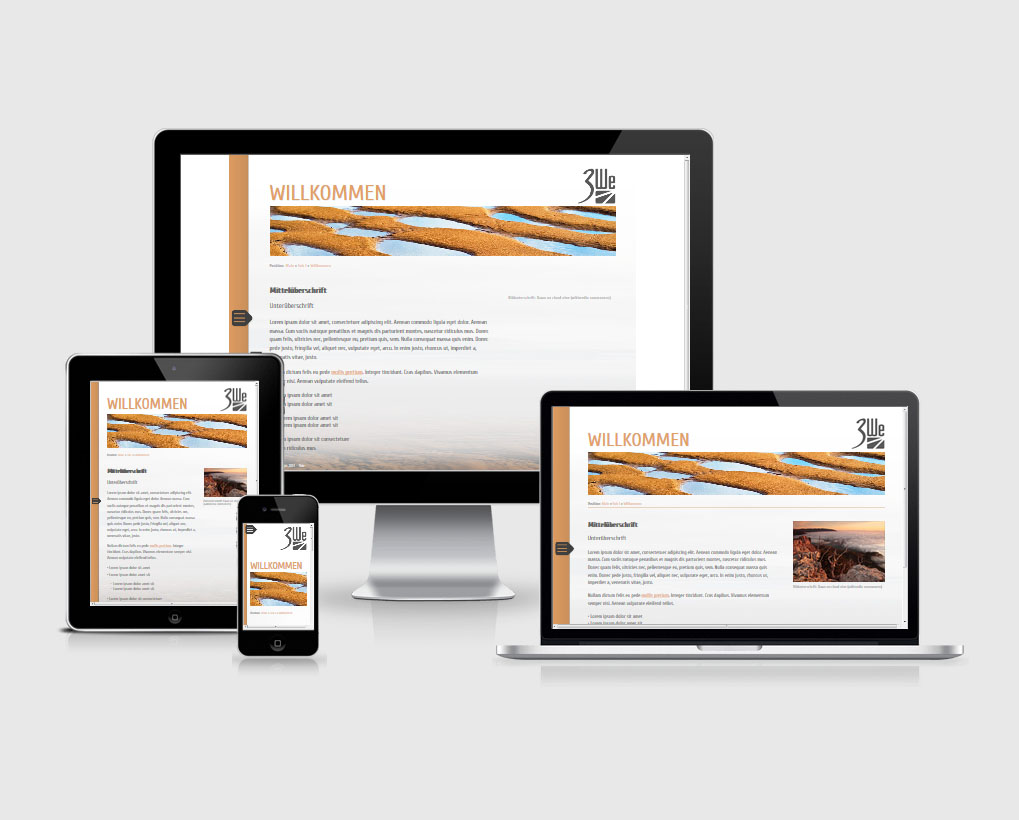
The themes are customizable within certain limits. Each theme is adaptive and responsive and thus equally suitable for different device classes (e.g. desktop PC/Mac, tablet, smartphone, etc.).
Info: Very old browsers like InternetExplorer 8 can only be supported to a limited extent. For security reasons, however, even Microsoft and most major website operators recommend that you use newer browsers such as Mozilla FireFox (from v3), Google Chrome (from v4), Apple Safari (from v3.1) or Microsoft InternetExplorer (from v9).
Of course, we are happy to design your individual web presence for you, which can then offer you even greater flexibility.
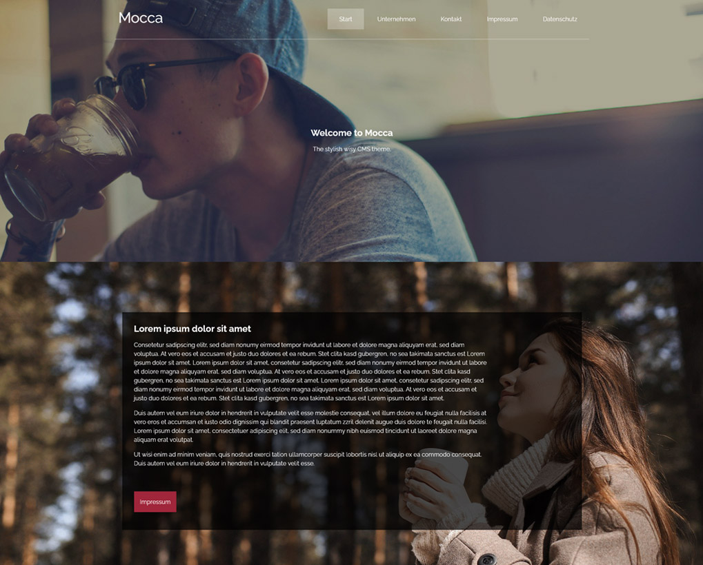
wisy Template 19 - Mocca
Mocca is a template built on large images that supports both one-pager and multi-page sites and can be used widely.
> Link to template
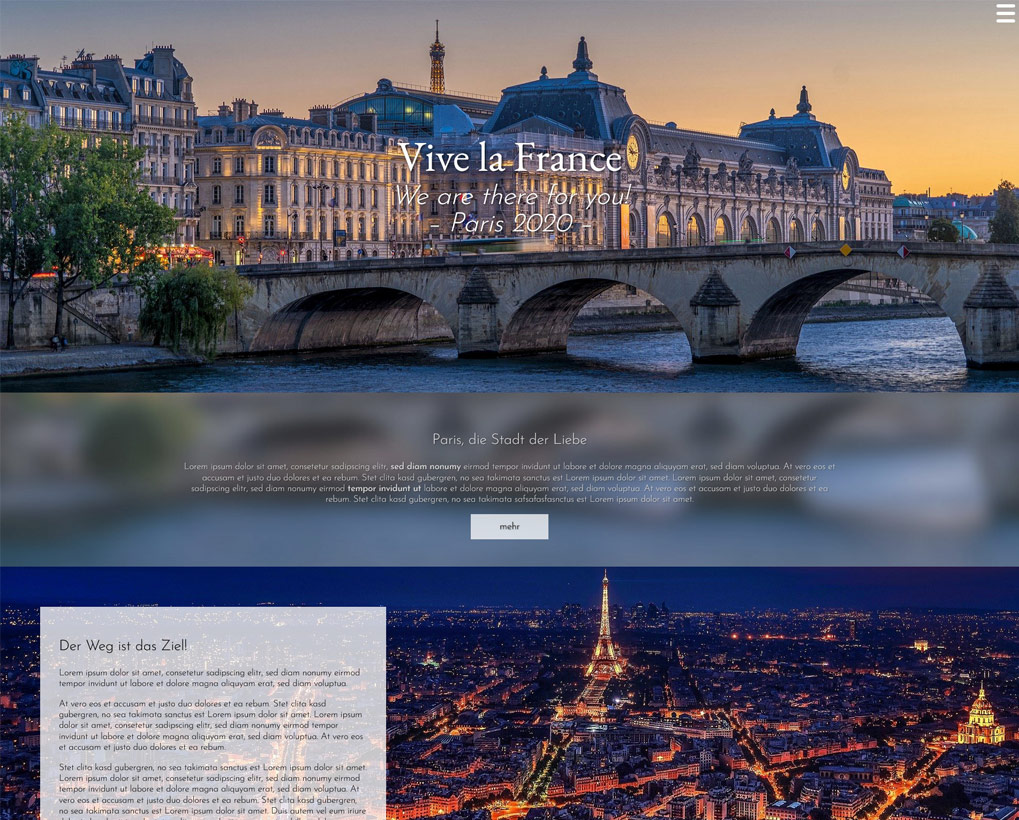
wisy Template 18 - Paris
Especially equipped with large impressive background images, the Paris template will captivate your website visitors.
You can showcase your key message in a particularly appealing way through the airy, layer-based parallax layout.
> Link to template
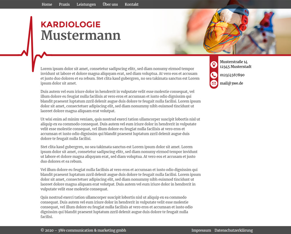
wisy Template 17 - Heartbeat
targomed is always passionate about its work and would also like to provide cardiologists and other physicians with a template for easy implementation of their practice website. For this purpose, the template Heartbeat was created, which is characterized by an easy-to-maintain, but effective structure.
> Link to template
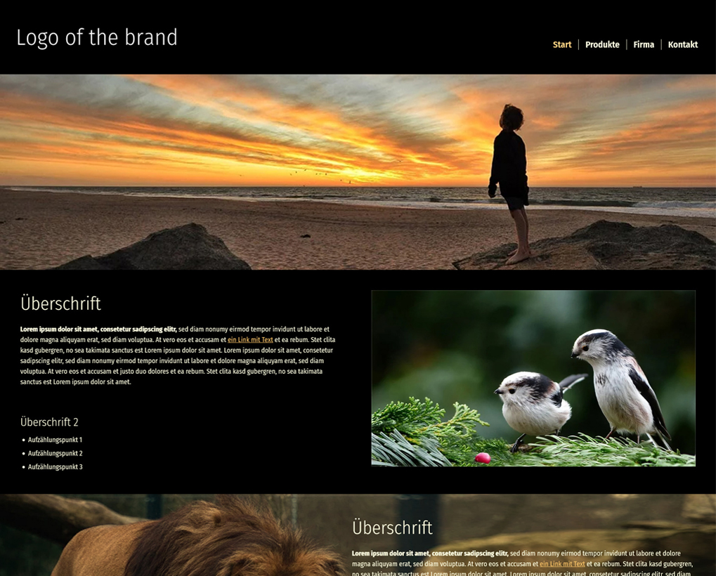
wisy Template 16 - Wild Life
Wild Life is a template designed for full format. It can be used with predefined content elements as well as freely definable.
> Link to template
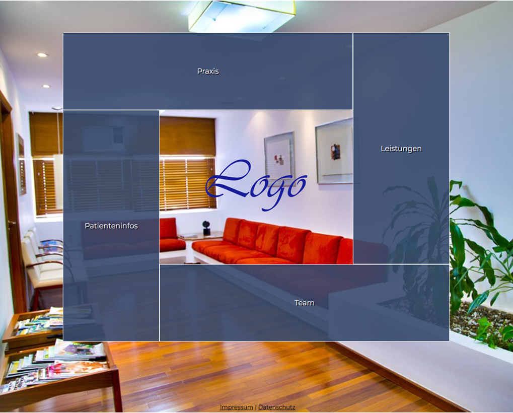
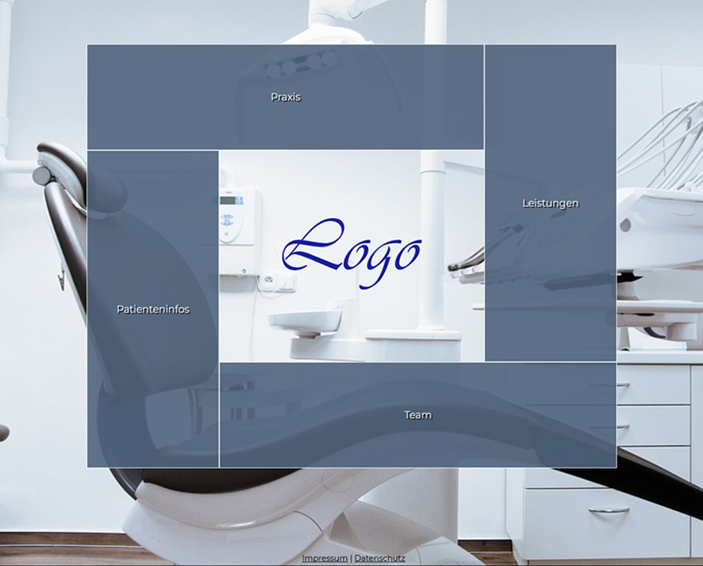
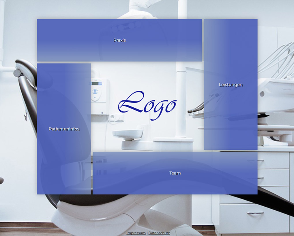
wisy Template 15 - Shell
Shell has a grid layout navigation that automatically adapts to the number of menu items. The company logo is highlighted by the surrounding menu items.
> Link to template
wisy Template 14 – PolyTri
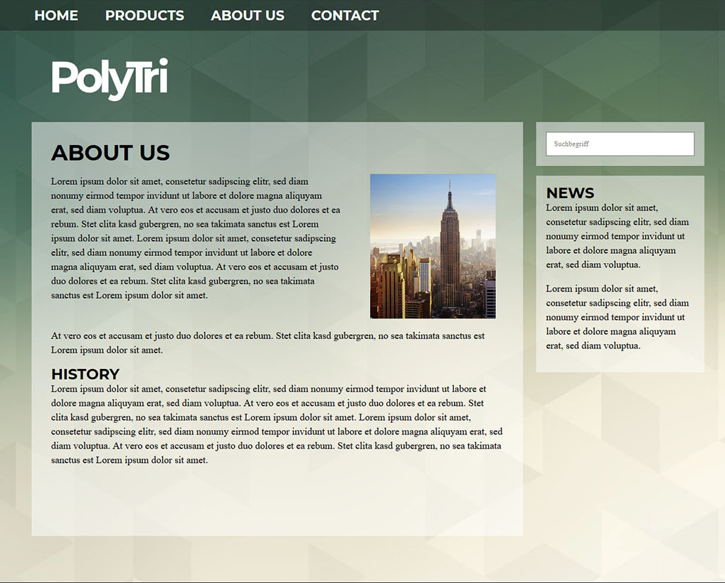
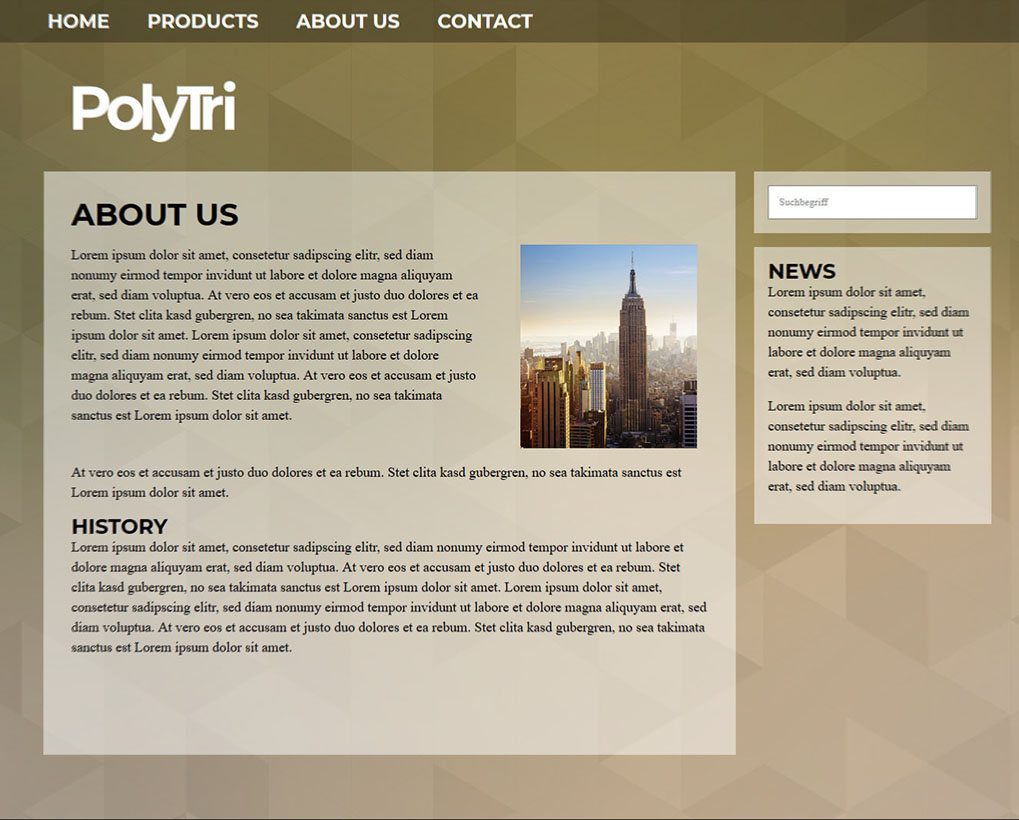
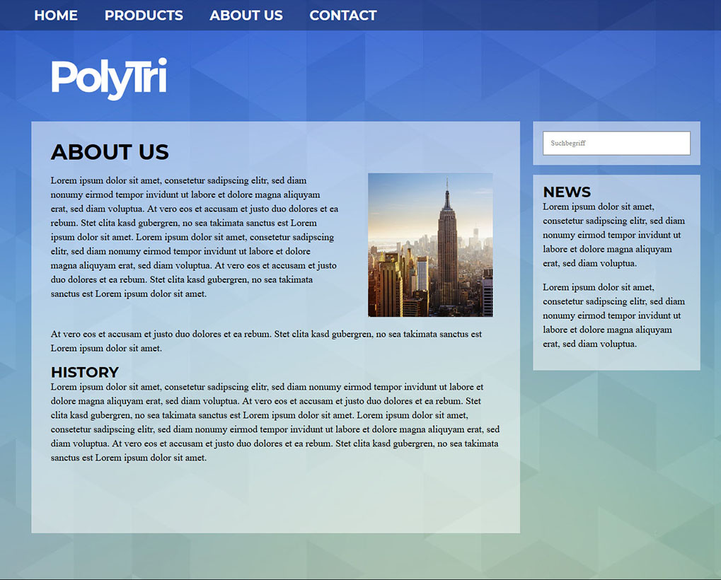
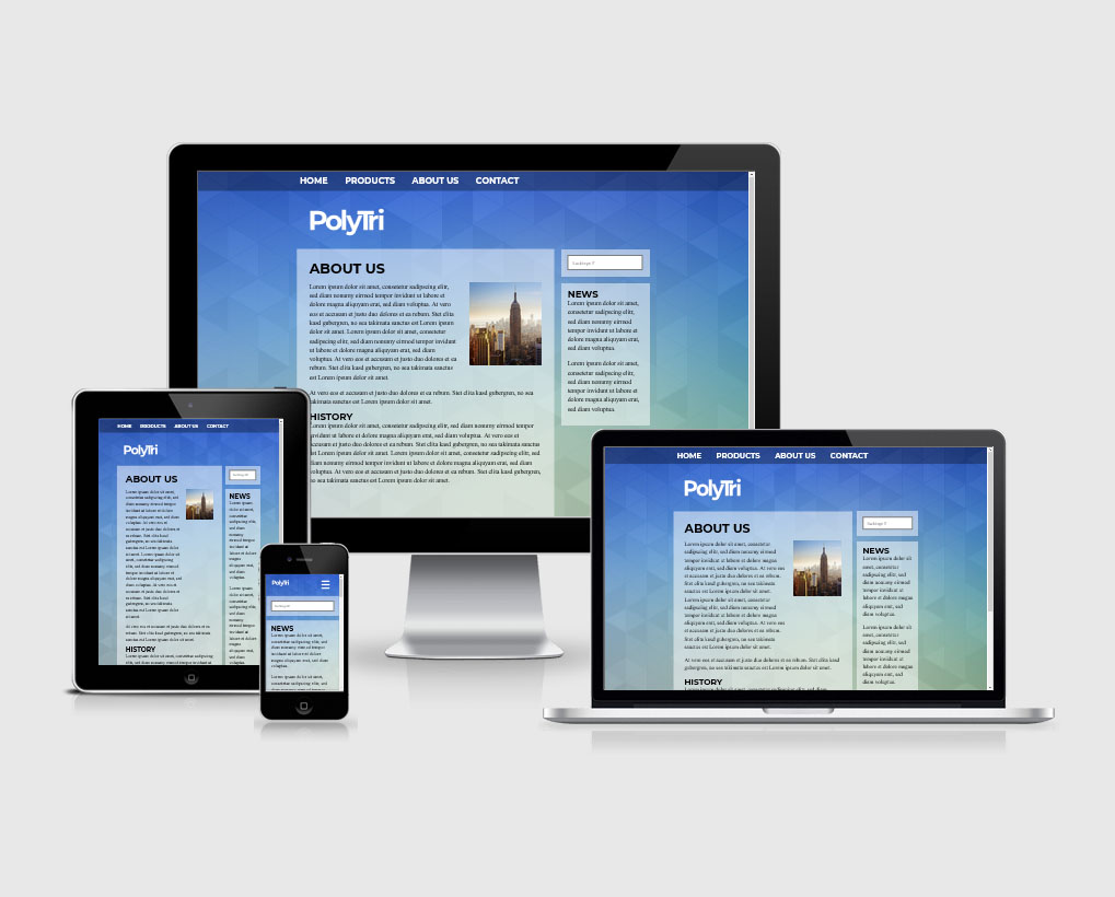
PolyTri is a 2-column theme with a flat design. The available colour sets allow you to change the basic colour between blue, orange and brunswick-green. Of course you can define your own color sets.
wisy Template 13 – Close & Far
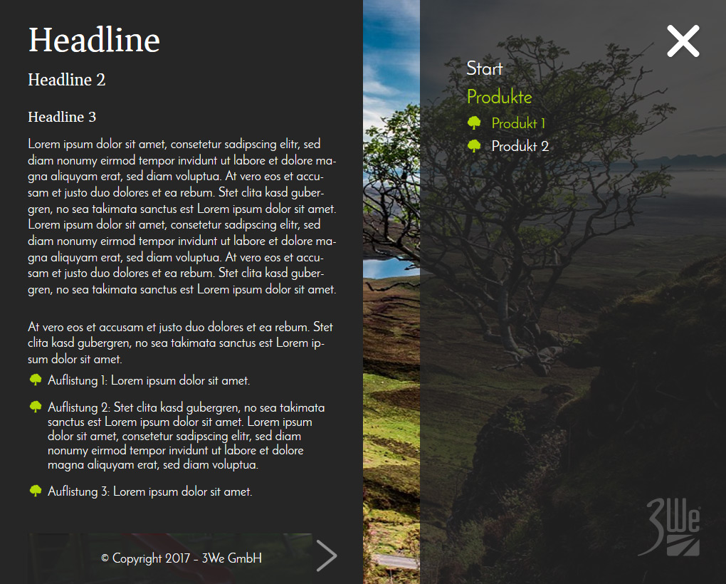
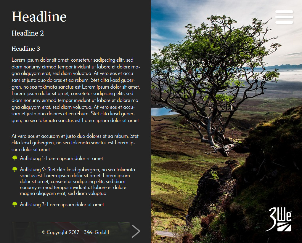
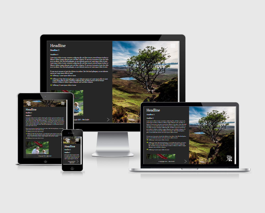
Close & Far is particularly suitable for presentation-like websites with touch operation and can convey depth and emotionality through the large page image and the left information board without having to do without content.
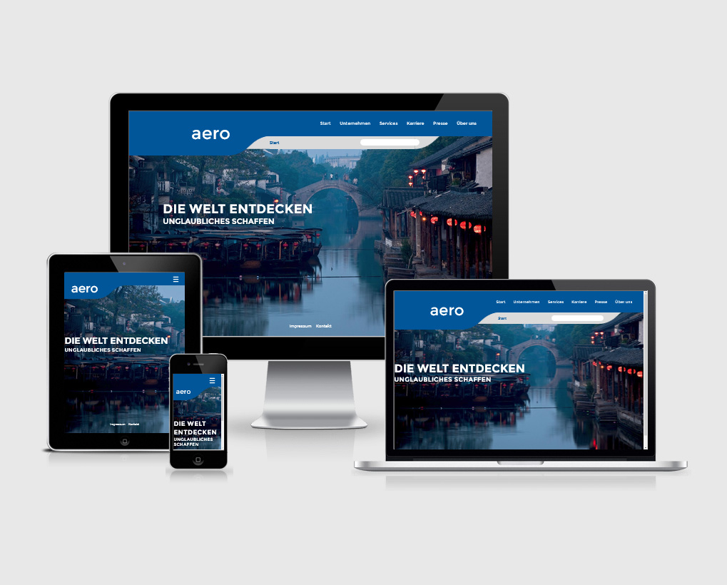
wisy Template 12 – aero
Due to its balanced curves, aero is a slim template that presents the contents very clearly and individually.
wisy Template 11 – United
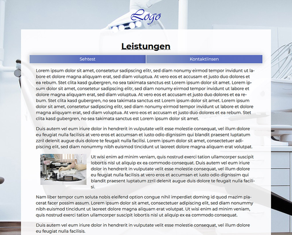
United impresses with its modern and clearly structured design, which can easily be individualized by the cover picture. The template can be easily adapted by using many colour templates.
wisy Template 10 – Colorful
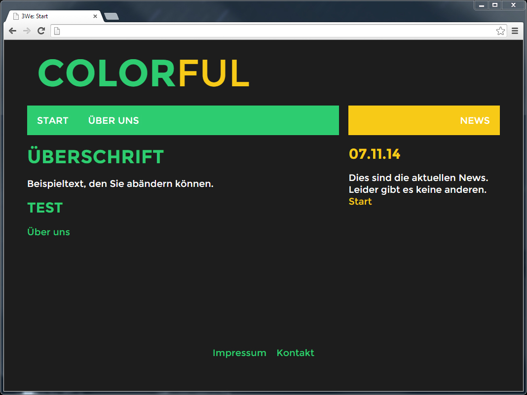
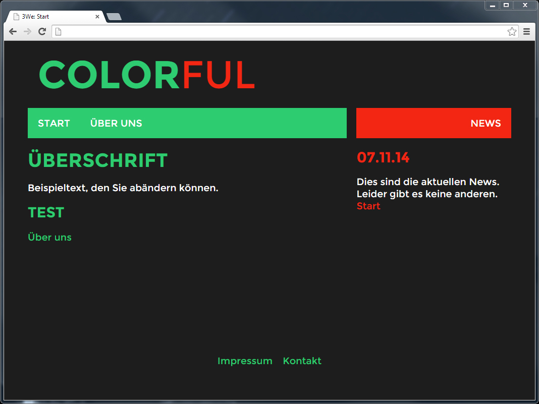
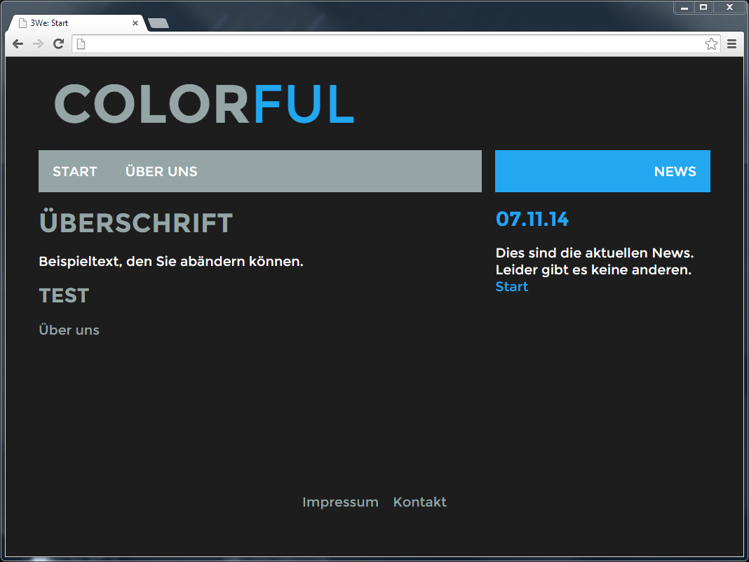
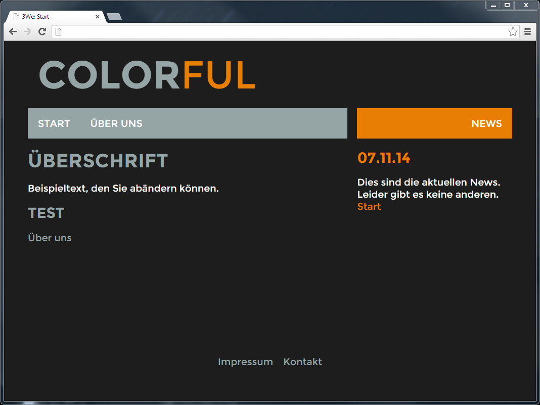
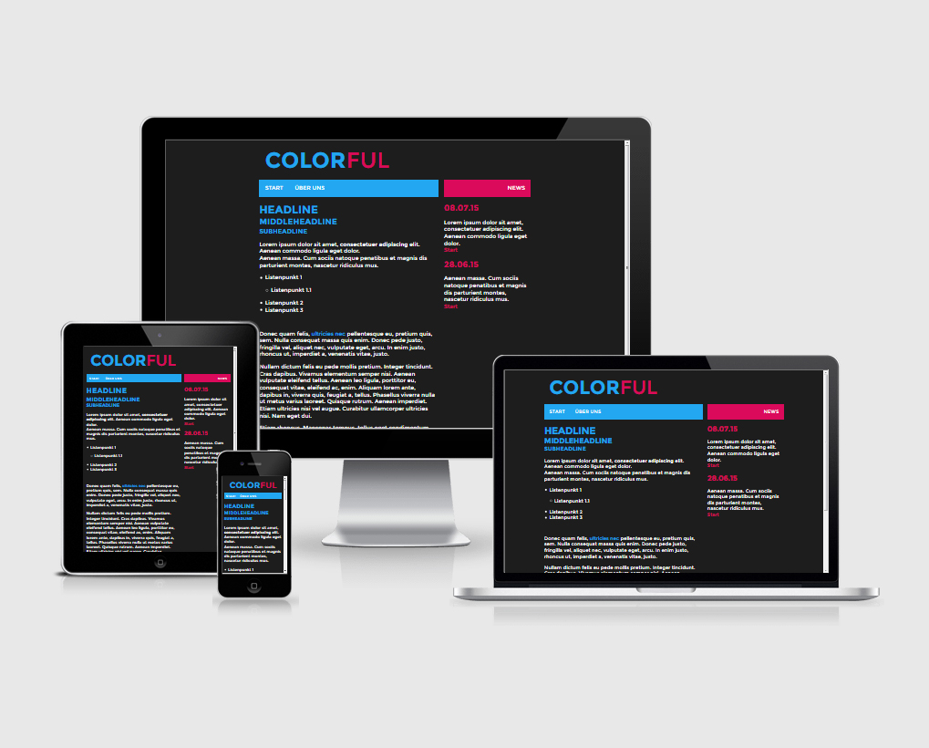
Colorful is suitable for modern and clear pages. Thanks to its minimalist design and varied colour scheme, visitors can also find their way around on mobile devices. Both main colours can be defined in the backend.
wisy Template 09 – Obsidian
Obsidian impresses with its large header image, which influences the coloring of the individual pages. In addition to an image gallery adapted to the template, a two-column layout can also be selected.
wisy Template 08 – Trinity
Trinity is a dark template with 3 columns. Due to the simple coloring Trinity looks tidy, but still offers a lot of space for content and menus.
wisy Template 07 – Three Bees
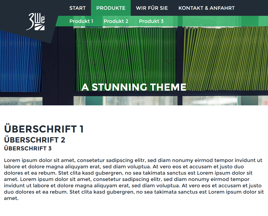
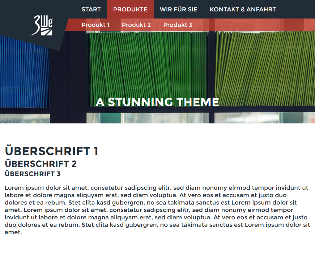
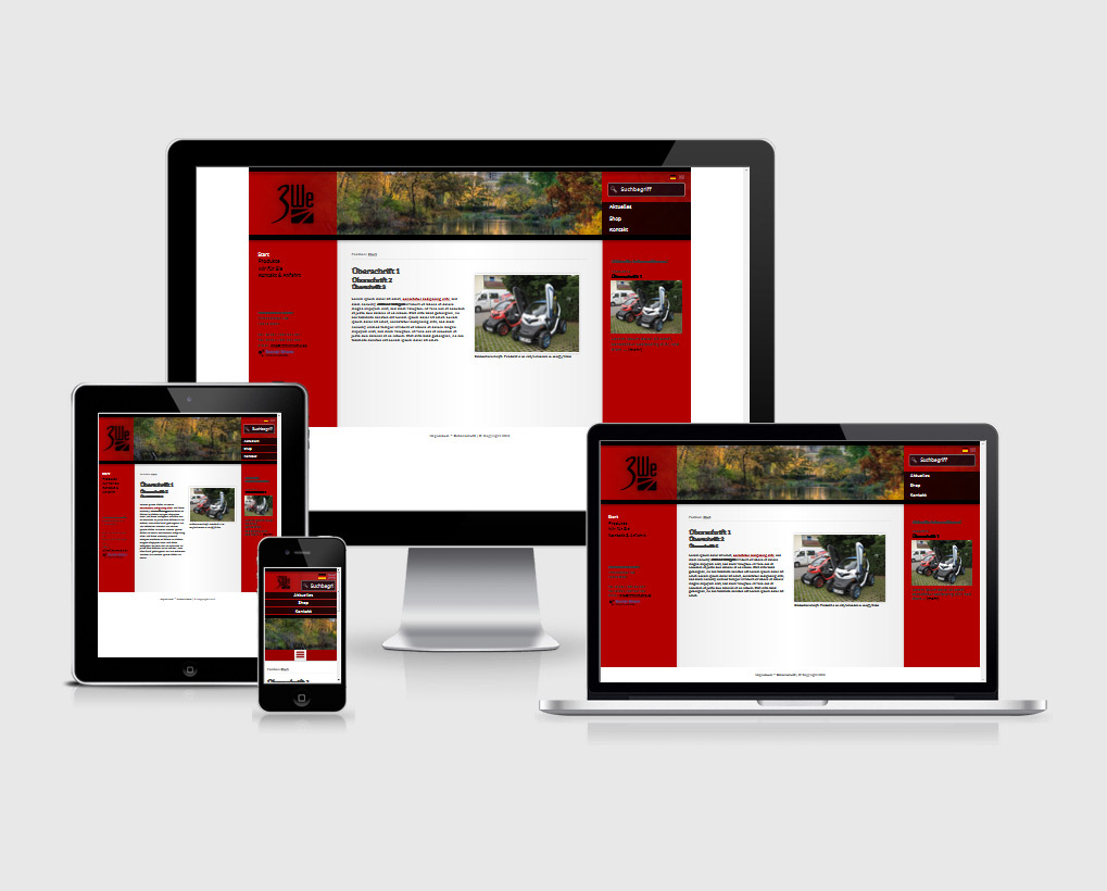
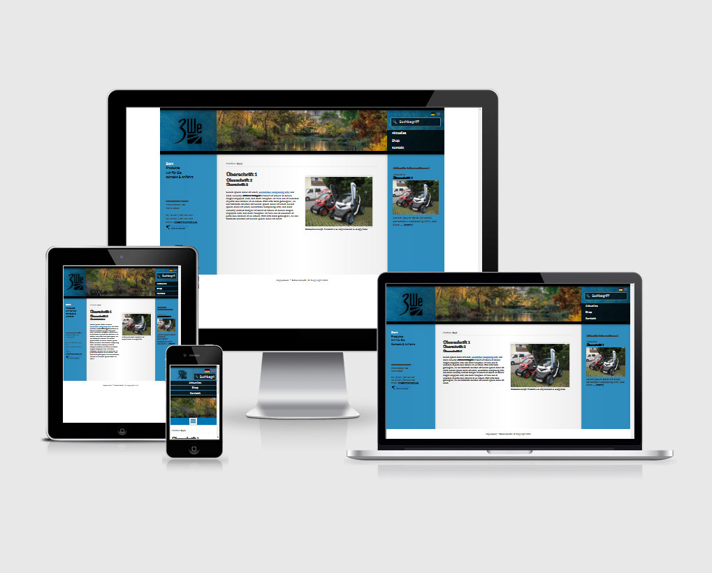
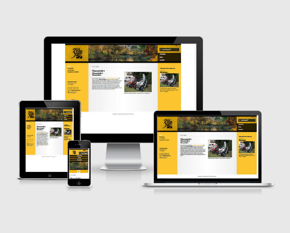
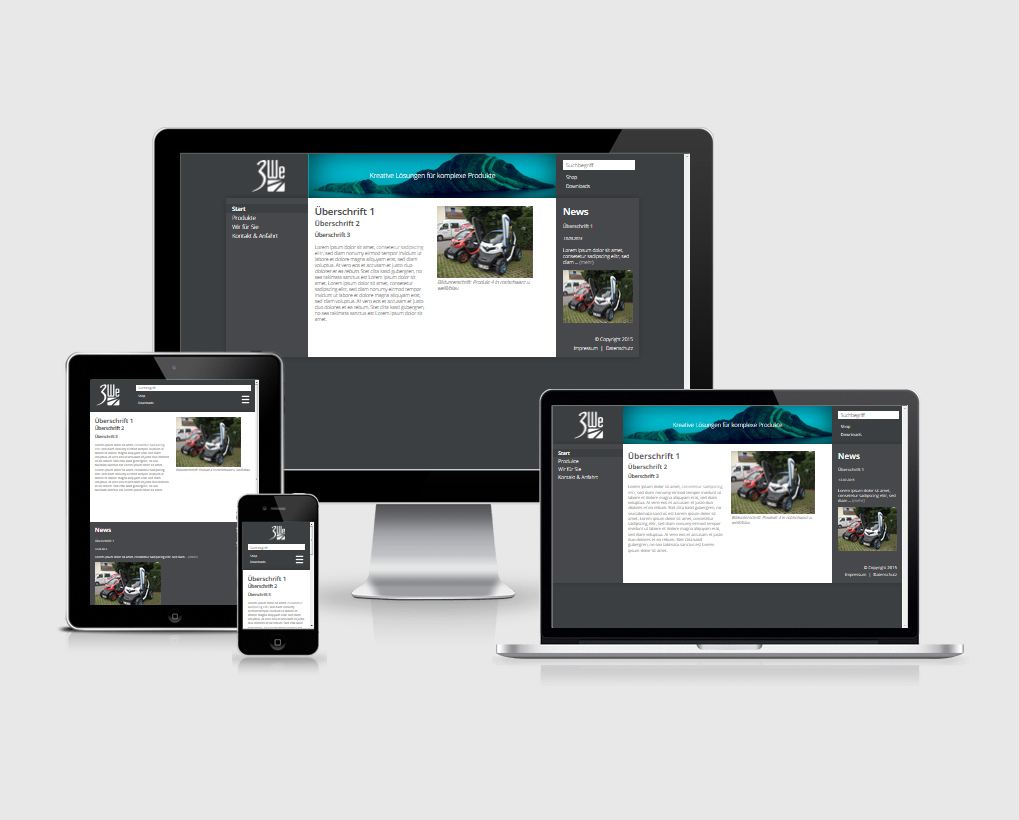
Three Bees is a three-column theme and is characterised by its special colouring, which can also be changed by the CMS user at any time. Included are 5 different colour sets. Further color sets can be defined with own colors in the backend.
wisy Template 06 – Vintage Dreams
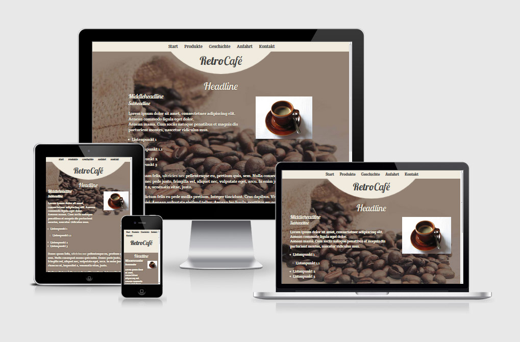
Vintage Dreams captivates by its simple structure and the strong effect of the background image. The template is also optimized for high-resolution displays and suitable for both current and future devices.
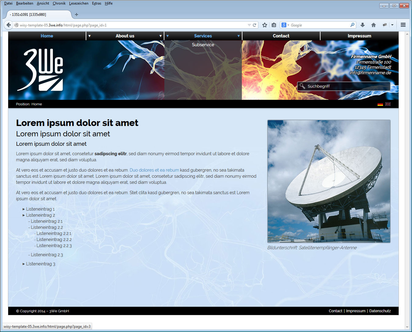
wisy Template 05 – Synapse
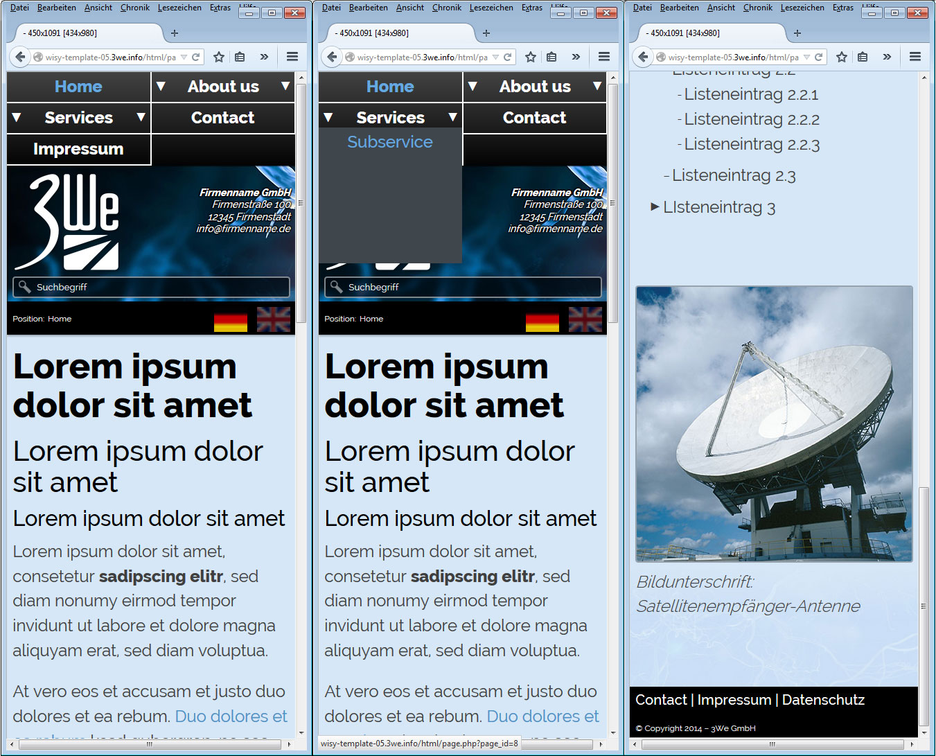
Synapse relies on rollover navigation. Sub-navigation points can be called using rollover navigation. On Smartphones (and other TouchDevices) the navigation is opened by a click on the navigation point.
Info: It is important with this type of navigation that the main points with sub-points do not provide any content or content that is not relevant for smartphone users, as these cannot otherwise be called up on touch displays. The first sub-navigation point should then be used for this content.
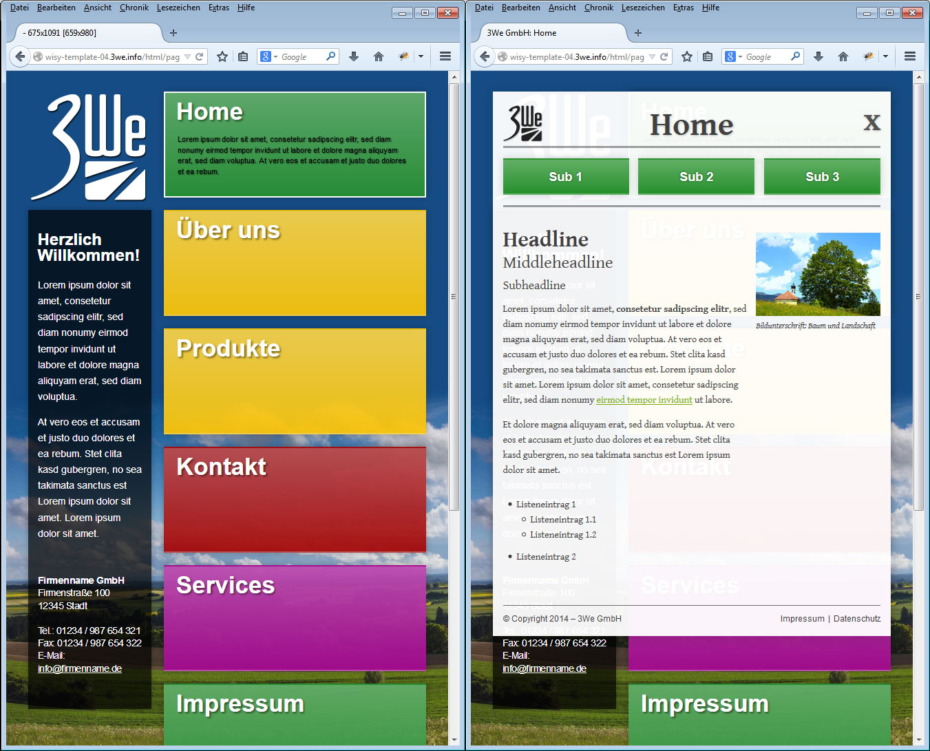
wisy Template 04 – Tiled Landscape
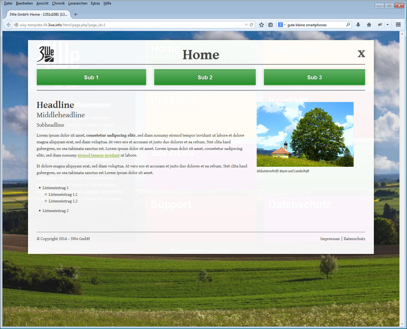
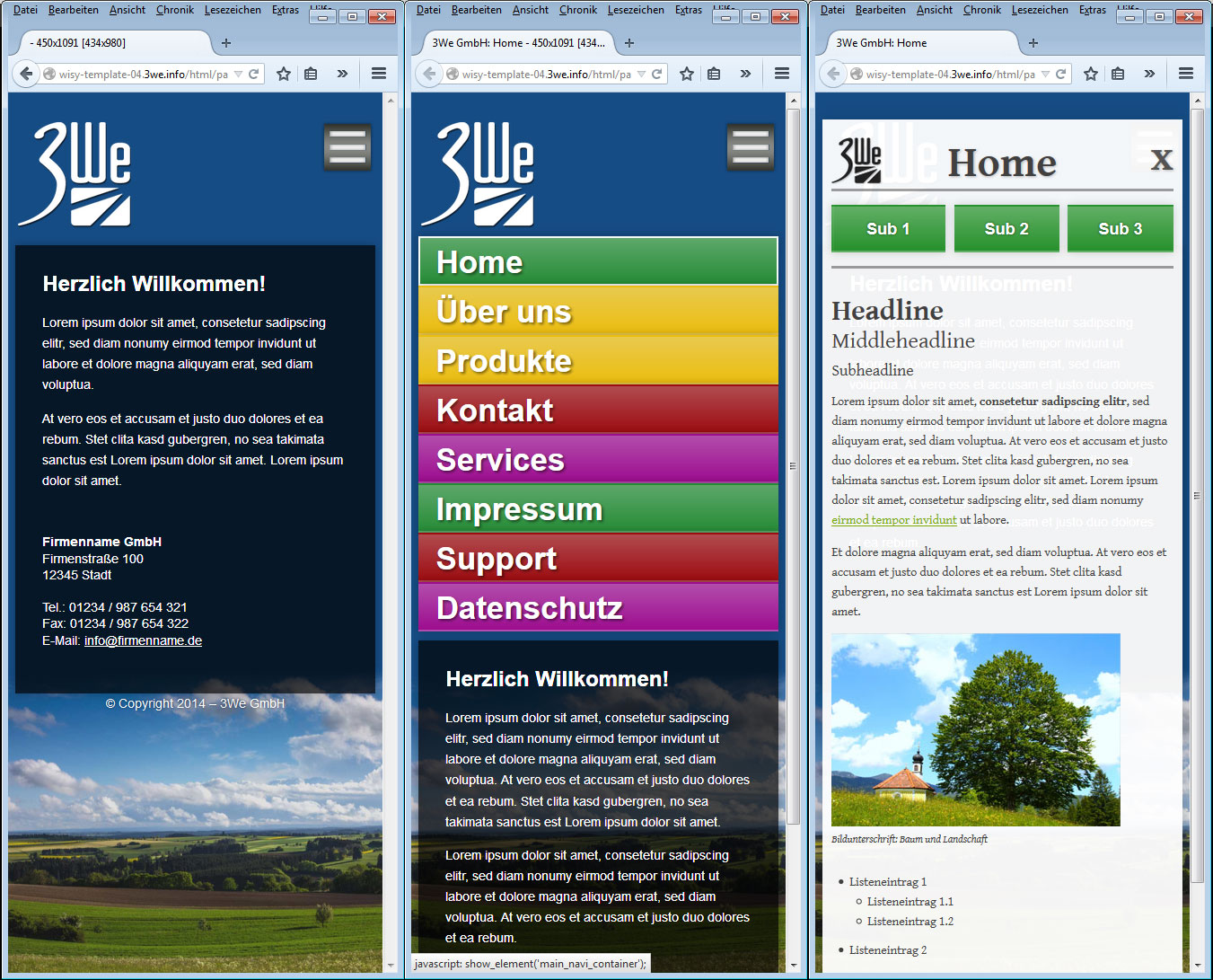
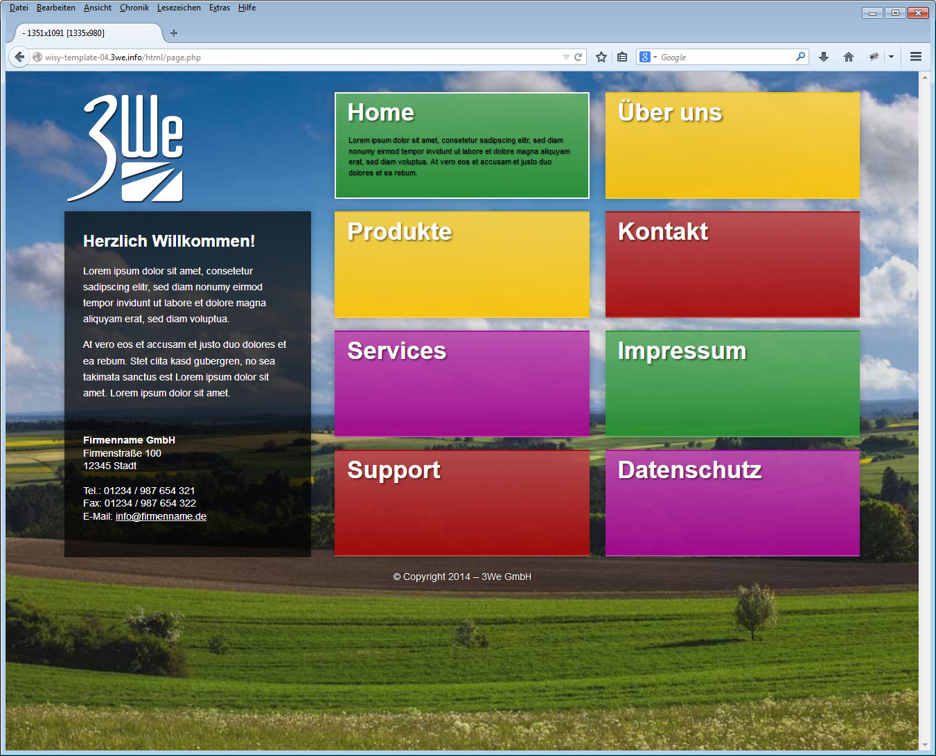
The tile navigation offers colourful and interesting possibilities. Here the content is placed as a layer over the actual navigation and closed accordingly as soon as you want to recall the navigation.
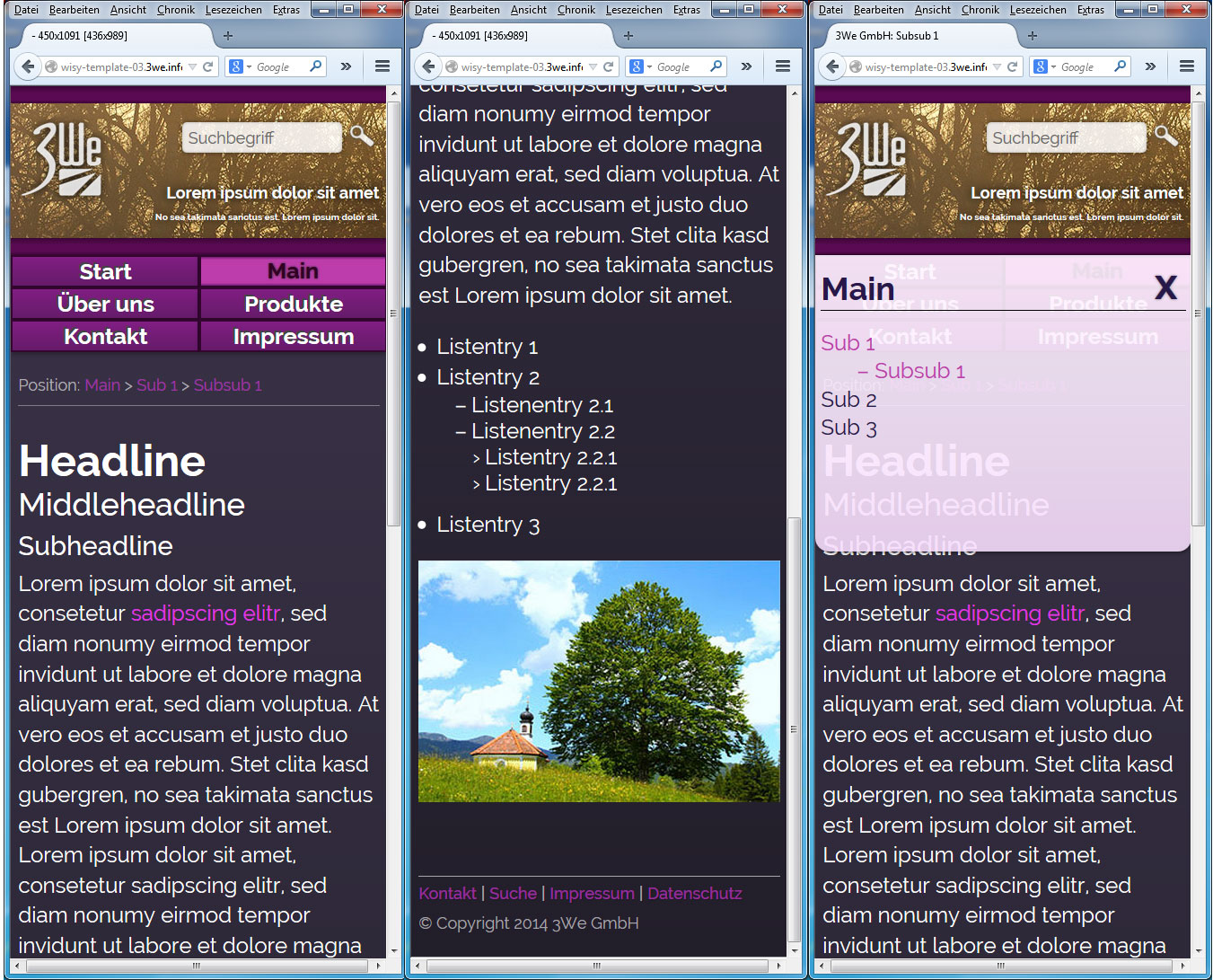
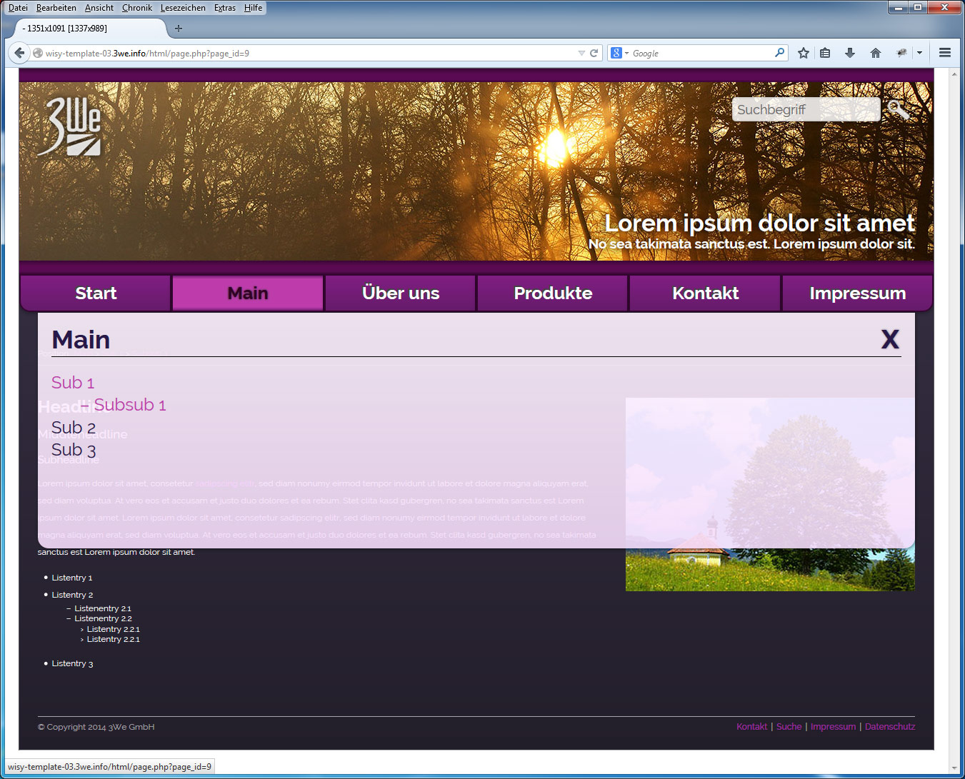
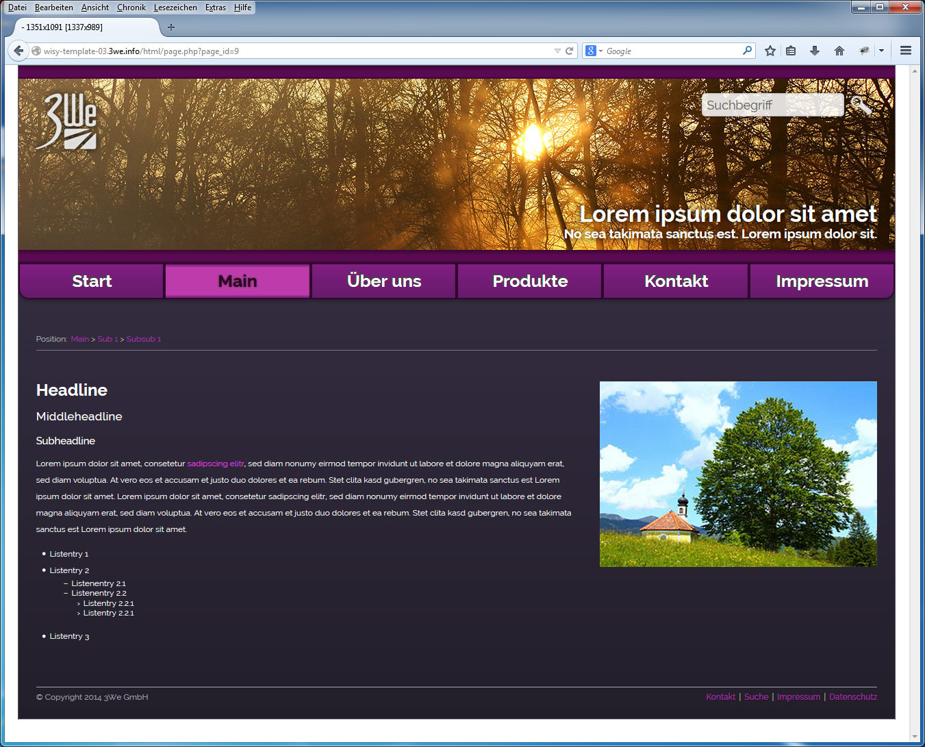
wisy Template 03 - Sunset
The template ’Sunset’ is characterized by a calm atmosphere and offers high flexibility despite horizontal main navigation. The navigation is realized via a sitemap layer navigation.
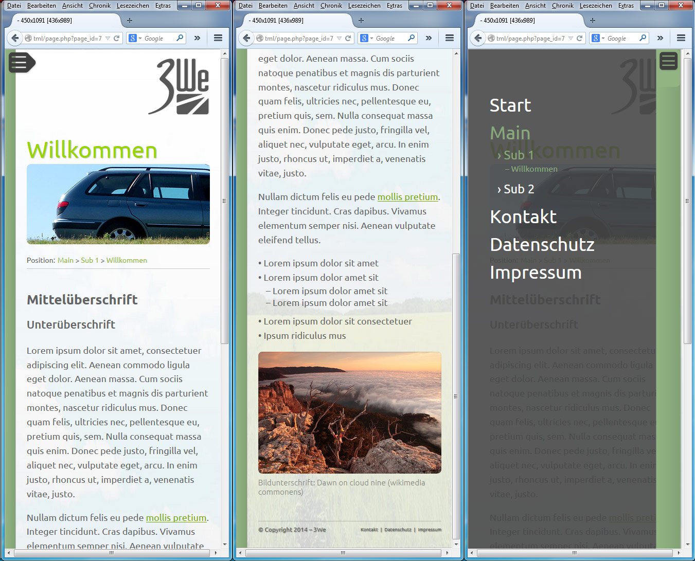
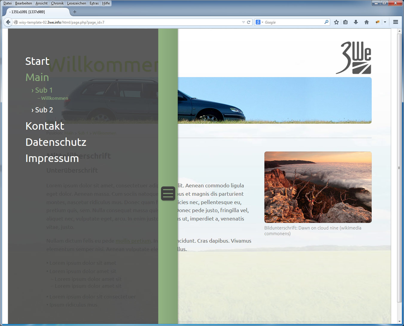
wisy Template 02 - Pure Natural
The template ’Pure Natural’ works only with discreet design elements and draws attention to the content. The navigation is also realized for desktop users via a folding navigation.

